Case Study: Apple Time Capsule
17 Mar 2009
Report for the Human Factors IN900C course for the Bentley University UX certificate.
Apple Time Capsule Case AnalysisÂ
Introduction
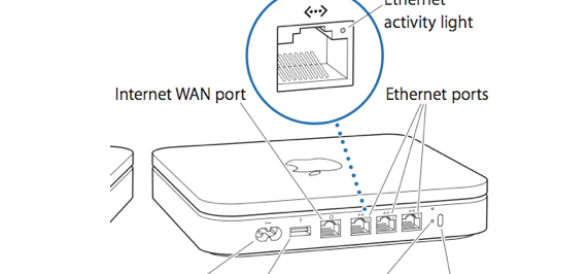
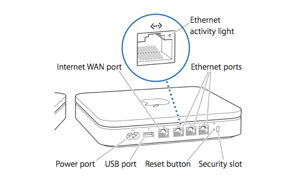
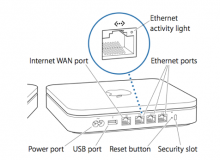
Time Capsule is a combination wireless network attached storage device and router by Apple Inc. It works in conjunction with Apple’s back-up utility Time Machine. The product consists of an Airport wireless router and a server-grade hard disk drive. Ports on the device include a WAN ethernet, three LAN ethernet ports and a USB port. The USB port can support a printer or external hard disk drive. Through use of a USB router, the USB port can be expanded to accept multiple printers and hard disk drives.
Configuration and management of Time Capsule and any connected external devices are managed by Apple’s Airport Utility.
Emotion: Motivation and Anxiety
Apple addresses the last of the six-part model, emotion early in the interaction with the product.
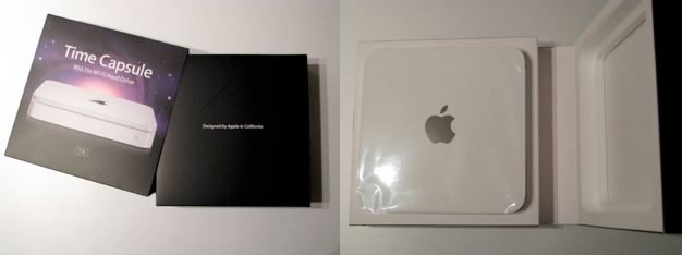
Consistent with Apple packaging design, whether the user is opening a $5000 MacPro or a $129 iPod one first experiences Apple products through its packaging design. While many companies enclose their products in tamper proof PVC materials, Apple uses a precision-cut styrofoam surrounded by a full color cardboard box.
The outer box has an opening on one side where an inner box resides. The inner box consists of two halves that open like a book (though the binding is on the right side as though the user opened the book with the front cover down). There is no ambiguity when opening the packaging. Cues are provided to the user as to how to remove the product from its packaging. The inner box slides out of the outer box easily.
When the inner box is opened Time Capsule sits upright with the Apple logo prominent. The Time Capsule is surrounded by a plastic wrap that protects from scratches while being translucent enough that all the lines of the Time Capsule are visible.
Just underneath the Time Capsule is a white envelope containing the software CD and user documentation. A label on the outside of the envelope instructs the user to “Install software before connecting base station”.
The first user document encountered is “The Need-to-Knows of Backing Up” a one page sheet explaining the first backup. It urges users adding Time Capsule to an existing network to make Time Capsule the primary base station, and explains rudimentary information on the back up process. The second document is the “Setup Guide” which contains:
- Getting Started
- Setting Up Your Time Capsule
- Tips and Troubleshooting
- Learning More
- Service and Support
Setting up a wireless network and a backup system may be a daunting task for novice users. As Apple customers have come to equate Apple products with ease-of-use, this out-of-box experience is meant instill confidence and reduce stress. Stress can negatively affect information processing by reducing available working memory.
Other than mention of the applicable wireless standards (IEEE 802.11a, 802.11b, etc.) all included documentation limits the use of technical jargon or acronyms using commonly known terms.
While the above is geared towards the novice user, more technically inclined users might be apprehensive by the lack of technical information available. While Time Capsule supports back up of multiple computers, nothing in the documentation actually tells the user how this is accomplished. Time Capsule and the Airport Utility actually manage the hard disk drive resources transparently. Expecting to do up front tasks such as partitioning the hard drive a more advanced user might be hesitant as Apple doesn’t account for the advanced user’s mental model of what disk drive set up entails.
Throughout the set-up process, Airport Utility, the software Apple created for managing wireless products, provides users with assurances that the process is moving forward. When a setting is about to change Airport Utility provides feedback in plain english in the form of a pop-up dialog box. In addition to prompting the user these boxes inform the user of the implications of their choice.
The set up process controls information density by proceeding in short, well explained steps. At the end of the set up process, the user is rewarded with a green check mark and audible chime indicating that the user has completed his task.
The Sensory System
Set up of Time Capsule using the Airport Utility relies primarily on the visual sensory system. Though an argument could be made for the role of sound (the movement of the hard disk drive, the chime when the setup task is complete) and touch (heat emitted by the Time Capsule during operation) during this experience, their effects are small and fall outside the scope of this evaluation.
From a hardware perspective Time Capsule uses a status light to inform the user about the state of the product at a glance (without using Airport Utility). The colors used, green (approximately 525nm wavelength) and amber (approximately 590nm wavelength) fall within the visible spectrum in which the human eye is most sensitive. The two wavelengths are also different enough that under most circumstances the user can discern which color is being displayed. (Some less expensive green Light Emitting Diodes use a higher wavelength around 565nm and can appear yellow).
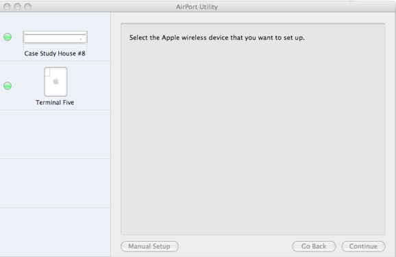
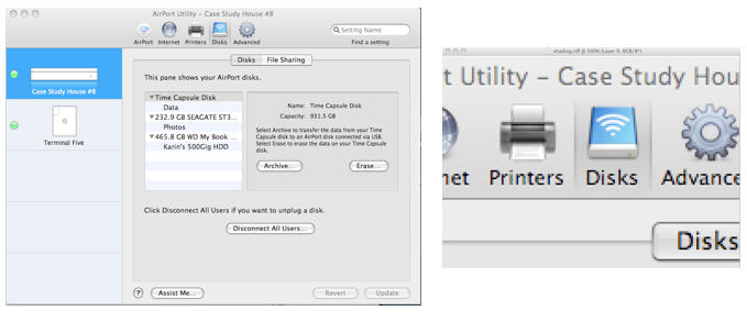
The graphical user interface of the Airport Utility software is divided vertically into two parts. The left column, a light blue shade, provides a list of wireless devices using illustrations to show which type (Airport Express, Time Capsule, Airport Extreme, etc.) as well as a representation of their status lights. The right column; a light grey region which uses more than two thirds of the application real estate, is used to convey information specific to the wireless device the user wishes to work with.
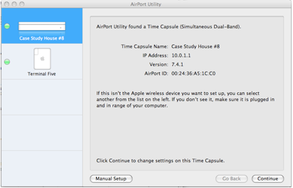
When the user selects a wireless device, the region displaying the selected device turns to blue (R=0, G=153, B=255) and basic information of the device is displayed on the right area in black text.
Two levels of hierarchy exist while a wireless device is selected. At the top level appearing as though they are etched in metal are labels for “Airport”. “Internet”, “Printers”, “Disks” and “Advanced”. Through the subtle use of contrast (one pixel wide darker lines on either side of the icon and a slightly darker background) a selection of any of these labels appears as a though some metal has been machined away.
At the second level, selections appear less metallic and more like traditional GUI buttons. The selected label is colored blue.
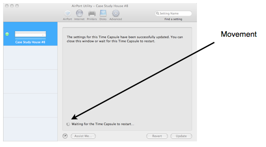
During times when the system is rebooting or upgrading settings on a device, Apple uses movement in the form of a rotating circle pattern to guide the user’s eyes to a message informing the user that Airport Utility is processing data. Much of the information in Airport Utility is contained at the upper half of the GUI. To attract users attention to a location that is very likely outside the user’s foveal vision, Airport Utility uses movement to take advantage of the peripheral vision’s strength.
Pre-Attentive Processing
Identifying certain basic visual qualities, pre-attentive processing, occurs quickly and accurately by the low level visual system. The Airport Utility takes advantage of pre-attentive processing in several ways.
Color and movement are sparingly used as stimuli to draw the user toward important portions of the GUI.
User actions are started at the top left side and color guides the user to the current wireless device on the left hand device list. Representations of the wireless device status lights are quick to discern. Uses can instantly see the wireless network operating normally (all indicators green).
Movement during time when software is updating a device guides the attention of the user to a particular region of the screen.
The far right portion of the GUI contains little to no information. Banner ads in web pages and web design convention has minimized the effectiveness of placing information in these spaces.
Through the Airport Utility, users are able to view the status of their wireless system quickly at a glance.
Prior Knowledge and Mental ModelsÂ
The Time Capsule documentation and setup appears designed specifically with the novice in mind. With the use of plain english and minimal technical jargon, information is kept in manageable chunks. Device setup is broken into short tasks keeping information density low.
First, Airport Utility prompts the user to enter a wireless device name and password. The second chunk of information regards how this new device is to be used. Choices are: forming a new wireless network, replacing an existing base station or joining the current network. Depending on the user’s selection there are either three or four additional screens the user needs to navigate through before arriving at a summary page. The summary page allows the user to see at a glance the results of process. Clicking “Update” tells Airport Utility to make the appropriate changes.
For the expert user Airport Utility provides a Manual Setup option which allows the user to configure the system in their own flow. More advanced features such as Port Mapping and IPv6 available to the expert user and use slightly more technical language to describe these more complex concepts.
One shortfall of Time Capsule, Airport Utility and the documentation is that some advanced concepts are not addressed for the expert user. For example, the hard drive space on Time Capsule may be used to support Time Machine on several Macs. The expert user may wish to know how the disk drive space is allocated to each Mac. They may also wish to re-allocate resources based on the Macs on the network. This allocation of resources is kept out of view and not addressed in either Airport Utility or the documentation.
The above criticism is similar to early criticisms of the Mac OS by expert users used to the DOS command line who felt that the GUI hid processes from the user. Additionally, there may be some resentment in the fact that the user cannot change the disk space allocation. Airport utility makes these decisions and the results are invisible to the user.
Cognitive FactorsÂ
In the physical space Time Capsule’s I/O ports support a hierarchy where the device provides four ethernet ports: one WAN port and three LAN ports. The majority of users will only use one ethernet port to connect to their broadband service. The ethernet ports are grouped in the back left to right as the WAN port and three LAN ports. The WAN port which is used by all users to connect to their broadband service is on the left. The LAN ports are grouped together and are the rightmost ports. The spacing between the LAN ports is approximately half the spacing between the WAN port and the first LAN port. This distinction is reenforced by the use of icons over the port with the WAN port icon differing from the LAN port icon.
In the software hierarchy, Airport Utility houses the most often used menu items top and left of the window (“Airport†and “Internetâ€). This holds true in the next level as well. When selecting “Airport†the commonly accessed menu choices are “Summaryâ€, “Time Capsule†and “Wirelessâ€. “Guest Network†and “Access†(a more feature used by advanced users) reside on the right.
The text in the Setup Guide differs from that used within the Airport Utility. In comparison text within the utility is sparse (reading to do) while the Setup Guide uses more complete sentences (reading to learn).
Memory System
The design of the Airport Utility succeeds by keeping working memory load low (during setup the user is only required to remember the password), chunks information in short meaningful groups (Airport name & password, followed by tasks described succinctly in one or two sentences with user answers entered as either text in fields of by radio buttons).
References
Visual Thinking, Colin Ware 2008
Human Factors Engineering, Christopher D Wickens 2004
